Thanks to Tristram Branscombe-Kent’s invaluable inspiration, thousands of consumers worldwide have come across the friendly checkmark-and-tree logo along with the ‘Forests For All Forever’ tag line. This year, as FSC celebrates its 30th anniversary, it honours his memory and conveys our gratitude, on behalf of all the people who work hard contributing to the health of the world’s forests and a healthier planet. Source: Timberbiz
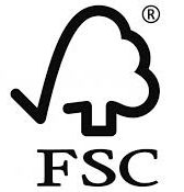
The FSC logo is a statement that tells you that the product that you have purchased has been produced using wood from a responsibly managed forest, ensuring that its biodiversity is respected while providing social benefits to the communities that depend on it.
Behind the FSC checkmark and tree, there’s a story of commitment by a group of people that came together 30 years ago. That group of people had a vision, and the creativity of a uniquely talented graphic designer.
It all started in 1994 when the first FSC members saw the need to have a logo that consumers and producers alike could easily identify with the mission for global forestry that was just dawning: to promote environmentally sound, socially beneficial, and economically prosperous management of the world’s forests.
These members were presented with an initial design that represented a cluster of trees casting a shadow in the form of a world map. Although the idea was adequate, “a number of stakeholders saw it difficult to recognize. Also, due to its size, the map left out some parts of the world, which was criticized by some members for obvious reasons,” said Tim Synnott, an FSC founding member and its first Executive Director. Therefore, a much simpler and efficient version was needed.
“The Board and I quickly realized that the first logo was quite unsuitable for labels due to its complexity, so we commissioned Tristram Branscombe-Kent to design a new one in 1995, a process that took several months of refining and agreeing,” he said.
Branscombe-Kent began his early career as a graphic designer in a variety of agencies and locations including London, Athens and New York before creating Tristram Kent Associates (TKA) first in Canterbury and then in Broadstairs.
Branscombe-Kent arrived at FSC’s first headquarters in Oaxaca, Mexico, in June 1994 to meet with the Board members at their third meeting and to gather their impressions.
The commission was clear: the concept had to immediately tell consumers that the product they were about to purchase represented the FSC mission and came from well-managed forests. The challenge was not easy, as this commitment was at an infant stage at the time and some of the green claims on labels that began to appear on products in the early 1990s were downright misleading.
“Consumers were simply not as knowledgeable about ethical choices back then and they had no way of knowing whom to trust or believe. It was a novelty, and we had to convey a very simple and effective message to reassure them,” said Mr Synnott.
After gathering the Board’s input, Branscombe-Kent hopped back on a plane and flew back to England, where he began to work on what came to symbolize the world’s first choice of responsibly sourced forest products.
Early sketches show a variety of options as he toyed with the idea that responsible forestry had to include imagery that would be immediately recognizable with the obvious – trees. These included a dual-shaped tree that was meant to symbolize a broadleaf and a conifer with the abbreviation FSC beneath it.
Other options were bolder and documented an interest in conveying more abstract symbolism, such as a photograph of a tree that had been digitally reduced to a minimal amount of bitmap information and meant to identify with the dawning digital age.
The final drafts were presented to the FSC Board of Directors, and the option of the checkmark-and-tree logo was accepted at the beginning of 1996. For the Board members, this was the perfect choice as it conveyed a tree with a universally recognized sign of approval – a checkmark. Twenty-five years on, it proved to be the right choice.
The logo was officially launched at an event in London on 21 February 1996, and the first product bearing it – the now legendary Sainsbury’s cooking spatula – was available soon after, beginning a journey that keeps telling us today just how important it is to buy products that help preserve the world’s forests for future generations.