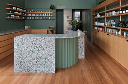
Bucking the trend of how a traditional pharmacy should look and feel, Astrid Dispensary on Chapel Street Melbourne, Victoria pushes the envelope of the modern day pharmacy, inviting patients in with lush green walls and warm timber tones seen throughout the new space. Source: Timberbiz
Melbourne’s up-and-coming architecture practice, Alte. Studio was awarded the job to bring to life the client’s vision of a modern-day pharmacy. The brief was to create a calming and inviting atmosphere that had no hint or undertone of a typical pharmacy.
With a focus on natural medicine and medicinal cannabis, it was especially important tocreate an environment where patients felt safe, welcomed, and relaxed.
Choosing a natural palette of colours and materials, Alte. Studio chose a deep green for the interior walls and matched the deeply toned colour with a light and bright timber Tasmanian Oak.
Experienced in using Tasmanian Oak on projects before, Alte. Studio Director Barbara Chung says she knew the local timber would be a perfect match for the new pharmacy fit out.
“Having used Tassie Oak previously on projects, I knew it would be the perfect feature material for Astrid. We wanted a timber that was local but also had enough variety in the grain and colour to make it a bit interesting and contrast nicely with the green we chose for the walls,” Ms Chung said.
“It’s been quite trendy to use a very pale, almost bleach-toned imported timber that has a Scandinavian look to it. It’s definitely a beautiful style but being in Australia and being an Australian business, for us it just makes sense to embrace the tones of the beautiful local timber we have readily available here,” she said.
Pushing open the existing oversized timber door, patients are instantly put at ease upon walking into the modern and airy space. A terrazzo stone benchtop centres the room, while the walls are lined with Tasmanian Oak veneer shelving, cabinetry and a bar top – all of which pop against the green walls.
While the Tasmanian Oak veneer was selected for its cost efficiency, Ms Chung explains the versatility was also a big bonus.
“We wanted to incorporate curves into the joinery to give the space a softer feel. Using a product like veneer made this possible, and while not an entirely easy task for the joiners, the end result is beautiful. A product like veneer highlights the versatility of a natural material like Tasmanian Oak,” she said.
The pharmacy is shortlisted for an IDEA Award in the Retail category.


