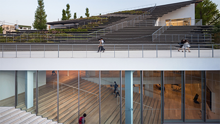
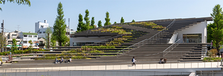
A sloped roof lined with wooden bleachers and plants conceals the student hub that Japanese studio Kengo Kuma and Associates has created for the Tokyo Institute of Technology. Sources: Kengo Kuma, Dezeen
Named the Hisao & Hiroko Taki Plaza, the building sits partially below ground and is intended to emulate a landform or river delta “that spills into the campus” of the Japanese university. Kengo Kuma and Associates designed the building to support student interaction, incorporating spaces for co-learning, workshops and support services.
Positioned at the main entrance to the Tokyo Institute of Technology (Tokyo Tech), the studio hopes that it will become a campus landmark.
“This building stands near the main gate of Tokyo Tech and is a new landmark of the campus,” explained the architect in charge Toshiki Meijo.
“The idea was to make the building look like a landform in order to harmonise it with the slopes scattered around the campus and the surrounding buildings,” Meijo told said.
However, the bulk of the building is positioned underground, disguised by the wooden bleachers that cascade over it. The other parts of the building that are visible above ground are kept minimal with a glazed or white-painted finish.
Kengo Kuma and Associates’ decision to submerge most of the building below ground was to retain views of the campus’ clock tower.
“The clock tower is the oldest building in Tokyo Tech and is a true symbol of the campus,” Meijo explained. “The visibility of this clock tower is defined as important in the campus masterplan.”Access is provided by a staircase that descends one side of the building, and a second that forms part of the roof and leads up to a small terrace on the building’s first floor.
The inaccessible parts of the roof are cordoned off and lined with plants. According to the studio, these plants match the greenery outside of the adjacent building called Library Hill.
Kengo Kuma & Associates has accentuated the stepped form of the building internally by inserting three staggered floors of workspace beneath the rising pitch of the roof.
The external staircase that descends into the building is also mirrored inside, helping to blur the boundary between interior and exterior landscape.
Hisao & Hiroko Taki Plaza’s small upper levels are designed as an open and continuous space that “flows ambiguously without clear spatial divisions”, according to the studio.
This is helped with the material palette of pared-back white furnishings and wood-lined floors that runs throughout.


